Fix: Elementor Single Product layout problem with too many add-on fields
Tutorials
If you use Elementor to customise your Single Product template, you probably use the Add To Cart element as your CTA. Usually this is fine, but if you use many Add-on Fields (the extra fields added by the WooCommerce Product Add-Ons plugin), the layout becomes unreadable. Here's how to fix it really easily.
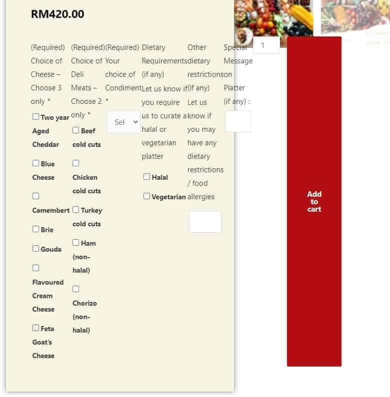
How to fix
This can be fixed with some simple CSS code (assuming you're using the Elementor version, and not from another plugin, e.g. Ultimate Addons). Just copy and paste the below into the Advanced tab, under Custom CSS:
form.cart {flex-wrap:wrap !important;}
.woocommerce form .form-row {padding:0;margin:0;}
.wc-pao-addon-name {font-weight:bold;}
.wc-pao-addon-description {font-size:0.9em; font-style:italic;}
.woocommerce form .form-row label {font-weight:400 !important;}
.woocommerce select {padding:5px;}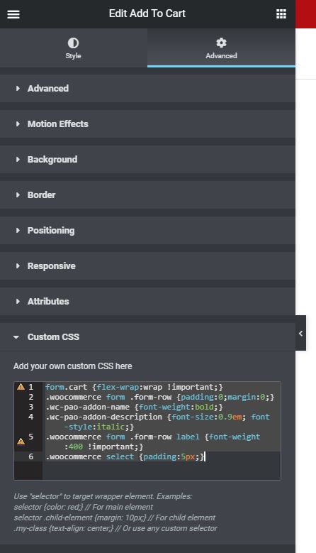
Here's what each line does, in case you want to adjust it for your own design:
form.cart {flex-wrap:wrap !important;}: this is the line that actually fixes the problem. It tells the browser to wrap the fields onto the next line instead of forcing them all into one..woocommerce form .form-row {padding:0;margin:0;}: reduces the space between options..wc-pao-addon-name {font-weight:bold;}: bolds the field label..wc-pao-addon-description {font-size:0.9em; font-style:italic;}: reduces the description size and makes it italic..woocommerce form .form-row label {font-weight:400 !important;}: unbolds the options..woocommerce select {padding:5px;}: reduces the size of the "Select an option" dropdown.
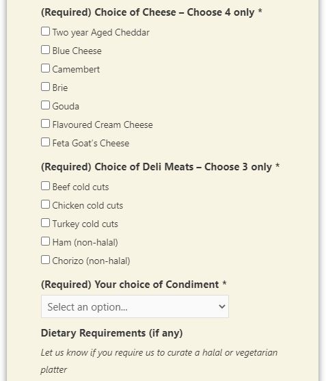
That's it! Super simple. Hope this helps you :)