All About Colors: Chromatic Value
Graphic design
Chromatic value is just the lightness or darkness of a colour, nothing more complicated than that. Take any colour and imagine converting it to greyscale: how light or dark does it land? That's its value, and it's the property doing most of the heavy lifting in a design, more than the hue itself usually gets credit for.
Add white to a colour and you get a tint of it, lighter than the original. Add black and you get a shade, darker than the original. A pale sky blue is a tint of blue. A dark navy is a shade of the same blue. Same hue, completely different value, and that difference alone is what makes a palette feel light and airy or dark and moody.
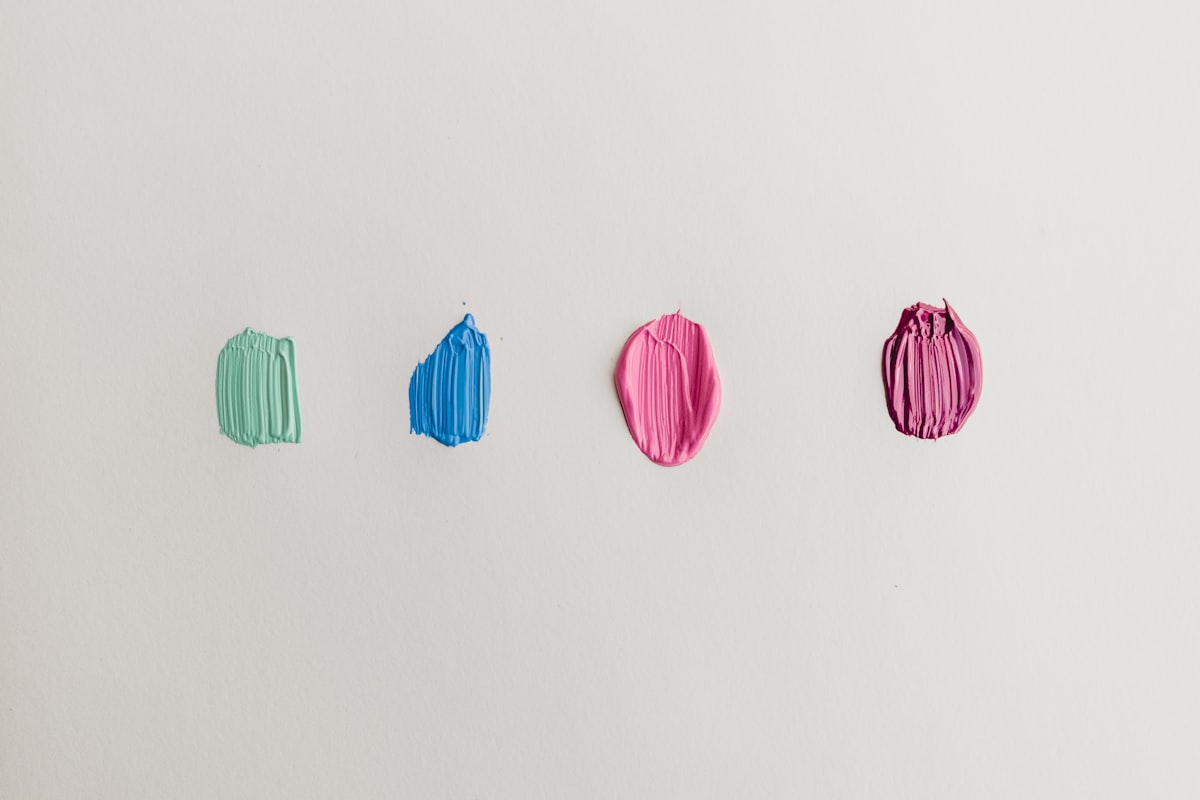
Why value matters more than hue
Your eye reads contrast in lightness before it reads contrast in colour. Dark text on a light background stays legible even on a cheap screen in bright sunlight, even at a glance, even for a colourblind visitor. Put two colours next to each other that are close in hue but also close in value – a mid-green heading on a mid-blue background, say – and the words go muddy no matter how nice the two colours look side by side in a palette tool. Hierarchy, the sense of what's a heading, what's a button, what's just background, comes from value contrast doing its job quietly underneath everything else.
Dark for nightlife, light for hospitals
This is why the venue examples work so well as a rule of thumb. A site promoting a club night or a concert leans on dark shades: near-black backgrounds, saturated accent colours, minimal use of tints. It reads as night-time and a bit dangerous, exactly the mood the event is selling. Flip that palette to pastel tints and the same layout would read like a birthday party invitation, not a rave.
A hospital or clinic site does the opposite on purpose. Light pastel tints, soft blues, pale greens, read as calm and clean rather than cold and clinical, which matters when the visitor reading it might already be anxious. Tints also tend to stay legible for an older audience or anyone with reduced vision, since light backgrounds with dark text are generally easier on the eye than high-saturation combinations. The colours are doing a specific job there: reassurance, not sterility.
Checking your own value contrast
You don't need any special software for this. Squint at your screen until the colours blur, or take a screenshot and convert it to greyscale. If you can still tell your heading from your body text, and your button from its background, once the colour has been stripped out, your value contrast is doing its job. If everything collapses into the same grey mush, the colours are carrying weight they can't actually hold on their own, and no amount of hue tweaking is going to fix that. Sort the lightness gap first. Worry about which exact colours you're using after that.